From Hexagons to Foresight
Not everything can fit everywhere, all the time, all at once. Cats, however, keep trying.
 Thijs Oosterhuis
If you read my previous post, From Chaos to Clarity , you’ll remember the goal: turn a pile of CSVs, shapefiles, and spreadsheets into one coherent thing — a spatial datacube you can actually work with.
That’s where H3 comes in.
The honeycomb that makes data talk
H3 slices the world into a honeycomb of hexagons. Each cell covers a similar area, so whether you’re mapping housing prices, noise, flood risk, or biodiversity, everything lines up on the same grid.
Think of it as Lego for geography. Once the pieces fit, you can build meaning — not just pretty layers.
Step 1 – One map, one story
Let’s start with one indicator.
Take groundheight (height above sea level). Put it on H3 and every hexagon becomes a simple answer to: how high (or low) is this spot relative to NAP?
It also explains why the Dutch cliché "God created the world, but the Dutch created the Netherlands" sticks around. A lot of the country is below sea level — yet we live, build, and cycle there because we’ve engineered it that way.
An interactive map (or a short flyover) makes that feel obvious in seconds:
This is the first step of spatial literacy: make the numbers feel like a place.
Step 2 – When one layer isn't enough: travelling through time
A single snapshot rarely explains change. The nice part of an H3 datacube is that the grid stays the same while the years move — which makes change feel a bit like time travel.
A quick detour: landcover vs. people
While poking around the datacube, I ran a simple correlation check between landcover (LGN) and a few demographic indicators (CBS). The positive hits were exactly what you’d expect: more built-up area tends to go together with more people and more homes:
- Total inhabitants (r = 0.79)
- Men and women (r = 0.79)
- Households (r = 0.78)
- Housing units (r = 0.78)
In other words: where you build more, more people live. No plot twist there.
The negative correlations were where it got more entertaining.
The strongest negative relationships show up between agrarisch grasland (agricultural grassland) and population density:
- Women: r = –0.43
- Total inhabitants: r = –0.43
- Men: r = –0.42
- Households: r = –0.40
Translation: the more grassland a hexagon contains, the fewer people live there — and, very slightly, the effect is stronger for women than men.
Perfectly logical spatially… and also a very tidy, data-driven explanation for "Boer zoekt Vrouw" ("Farmer seeks a wife").
According to the hexagons, farmers quite literally live in places with statistically fewer women. Pearson’s r has jokes, apparently.
Time travel on the Maasvlakte
The next example shows why this becomes useful. Built-up area is rendered in 3D height, colour shows the number of inhabitants. Slide through the years and you can watch neighbourhoods grow, densify, or change character.
A nice “wait, what?” moment shows up on the Maasvlakte in Rotterdam. Jump to 2022 and you’ll see tall blocks of built-up area — but the hexagons stay dark, meaning zero inhabitants. Not a bug: that’s industrial development on newly created land, not housing. The map makes that transformation obvious.
That’s the real power here: not just where things are, but when they appeared.
Step 3 – Talking to your data
Once the metadata is clean and structured (JSON helps here), something interesting happens: you can start treating the datacube like a thing you can talk to.
Say you’re looking for a house in South Holland, and you care about a few practical constraints:
- At least 0.3 m above NAP — wet shoes are fine, regular flooding is not.
- Not new-build only; show me places where living is already an existing function.
- Quiet-ish: below a certain background noise level.
- Not near a toxic gas cloud attention area (so not right next to heavy industry).
You can express that as normal questions:
- Where is the terrain higher than 30 centimeters above sea level (NAP)?
- Where is there already an existing residential function?
- Where is it relatively quiet, with noise below 50 dB (Lden)?
- Where is it outside a toxic cloud attention area?
An LLM can map those questions to the right fields and turn them into a query on the H3 datacube. No SQL, no hunting through column names — just a conversation, with the result showing up on the map.
The video is from a tool we built at the Province of South Holland: prompt on one side, map on the other. It works because the data is described clearly enough for humans and machines to mean the same thing.
And because the cube spans multiple years, you can ask time-based questions too. Suddenly, a trend analysis becomes a sentence.
For example: "Where did inhabitants decrease while forest area increased between 2018 and 2023?" The answer shows up as a map — and you can treat it like a new “quiet + green” criterion if you’re house-hunting.
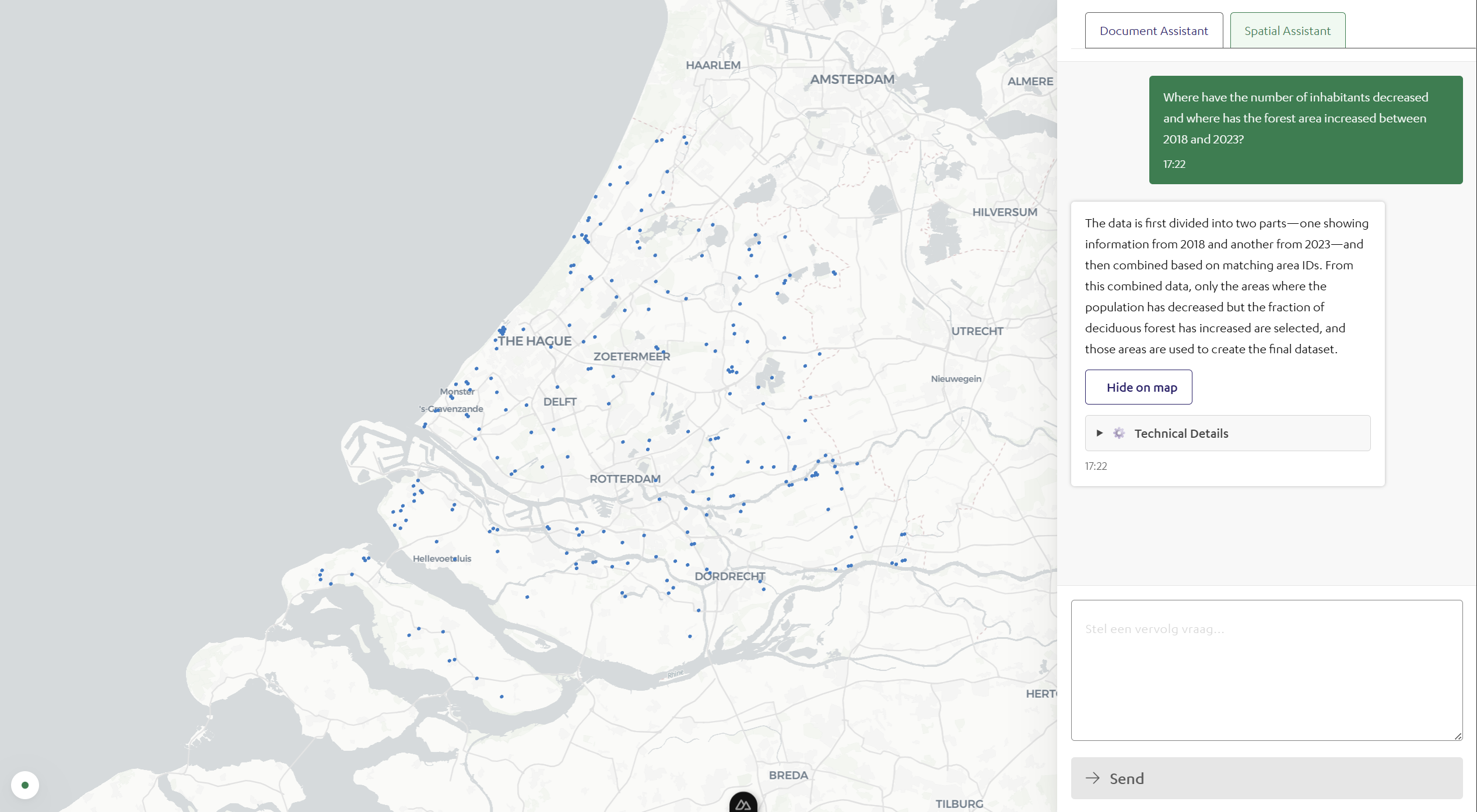
If you’re trying to optimize for calm, it’s a useful signal: fewer people, more forest, more breathing room.
Step 4 – From patterns to predictions
With 2018–2023 in one place, each hexagon holds a small timeline. Plot something like average WOZ value or new housing units and you start seeing trajectories: areas densifying, areas stabilizing, and areas shifting quietly in the background.
Even basic trend lines help you anticipate where pressure, growth, or risk could increase if the pattern keeps going. It’s not a crystal ball — but it’s a solid head start.
Once you can see trajectories, the conversation changes from “what happened?” to “what should we prepare for?”
Step 5 – Play, explore, decide
You don’t need specialist software to explore this. A good interactive dashboard runs straight in the browser.
In workshops, even non-technical teams start asking better questions almost immediately. Someone points at the map and goes: "Ah. So that’s why those two areas feel so different."
That’s the goal: spatial data that’s intuitive enough to explore. Sliders for year, WOZ value, noise level — suddenly managers and policymakers are testing ideas instead of reading tables.
Embed that in a blog post and readers can hover over their own neighbourhood and find the hexagons that surprise them.
Step 6 – Looking ahead
This is still the early version. Next up: connecting the same H3 grid to real-time streams — satellite imagery, sensor feeds, weather, biodiversity, the whole lot.
When datasets share one spatial language, collaboration gets easier. Maps stop being static reports and start acting like shared interfaces for decisions.
Final thought: the power of pattern recognition
Each hexagon is a data point. Together, they tell stories about how we live, build, and adapt.
H3 isn’t just about precision — it’s about a shared perspective. It lets managers, designers, citizens, and data folks look at the same landscape through the same lens.
From data to dialogue. From hexagons to foresight. From maps that describe the world to maps that help shape it.
Try it yourself
If you want to play with it: the first version of the datacube (land-cover, demographics, climate, plus municipality names from 2018–2023) is available here as a Parquet file . Download it and upload it to Kepler (with DuckDB). If you spot interesting patterns, I’d genuinely love to hear what you find — and what you’d use it for.